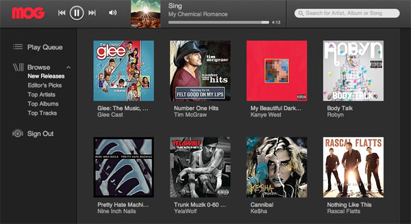
I consume a lot of music, and there’s no way that I could ever afford to purchase every album I listen to for $14.99. That’s where music subscription services come in. As a recent convert to MOG (from Rhapsody), I get excited every time I get even just a weekly update in my inbox letting me know what music has been added recently. But the announcement of an entirely revamped web app launched into Google’s brand new Chrome Web Store is something that anyone who loves music should pay attention to.
To get you acquainted with what it is exactly that MOG offers, here’s a quick summary of the $4.99 /month service (for $9.99, you get the mobile app too):
Unlimited Music: Access to over 10 million songs and close to one million albums, on-demand.
High Quality Audio: Music is streamed at 320 kbps; better than any other music service.
Best-in-Class, Personal Radio: The most powerful music discovery engine on the planet (powered by MOG Mobius).
One-click Access: With one click, get instant access to New Releases, Top Artists, Top Albums and Editor’s Picks.
Anytime, Anywhere: Unlimited access to the MOG app from any computer using Chrome or Safari browsers or on your TV (Roku and GoogleTV).
The Good (a.k.a. why it’s better than what it was)
So why is this new web app a good thing? Because the way that we interface with MOG’s library has been vastly improved. For starters, the browsing of MOG’s huge catalog and the managing of the ‘Play Queue’ all happens in the same browser window now. Where you used to click a button in one window to add a song to the queue in another pop-up, now an addition to the queue affects the window you’re looking at. This really unifies the user experience and brings MOG up to speed with the user experience that competitors like Rdio already offer.
Another improvement is the way in which you now browse and discover music on the site. When you click on an artist’s name after you either search for them or just happen upon them while browsing the site, a dropdown summarizing the content pertaining to that artist is shown. From here, you can view that artist’s discography, see their top tracks, play a radio station built around their sound, or dive deeper and see the individual songs that make up an album. Because the site is built as a web app meeting to the (relatively) new HTML5 standards, the absence of pageloads makes browsing the site super smooth. Jumping in and out of artist pages is quick and painless.
The Bad (or hopefully ‘The Temporarily Left Out’)
The site isn’t perfect though. As a beta release, this is understandable, but there are a few things that I hope are in the pipeline to be implemented soon. The first thing that stuck out to me was that playlists are nowhere to be found. When someone gives you unlimited access to a 10 million song catalog of music, you want playlists. In a larger context than just music discovery, the curators of today’s information landscape provide a great service to the communities that they belong to: they help content of value bubble to the top for everyone to enjoy. Leaving out playlists leaves out the ability for quality music to surface. Only a small fraction of the catalog is ever seen.
Another addition that I’d love to see is the ability to see more than just the music content offered by MOG when viewing an artist’s page. When I’m in a discovery mood, I want to know everything I can about an artist: their bio, maybe some photos, a few similar artists, etc. Last.fm does an incredible job of bringing this information forward on their artist pages.
Finally, I can’t scrobble any of the music I listen to with the new web app! I have no idea what percentage of MOG users are also Last.fm users, but this issue is bordering on being a deal-breaker for me. I’ve been OK with the inability to scrobble songs on my iPhone, but if I can’t scrobble on my desktop either, then I’m left in a pretty bad situation. This seems to be such a small feature to implement, I hope MOG throws this in very soon.
The All-In-All
So where does this leave the music subscription space? Rdio has a great interface and iPhone app but no catalog. Rhapsody has a gigantic catalog but the worst interface out there. MOG offers it all: the ideal UI, a large (and quickly growing) catalog, and mobile apps that are winning awards as fast as they can be awarded.
- MOG.com (the old interface)
- The MOG Walkthrough
- MOG Music – Chrome Web Store