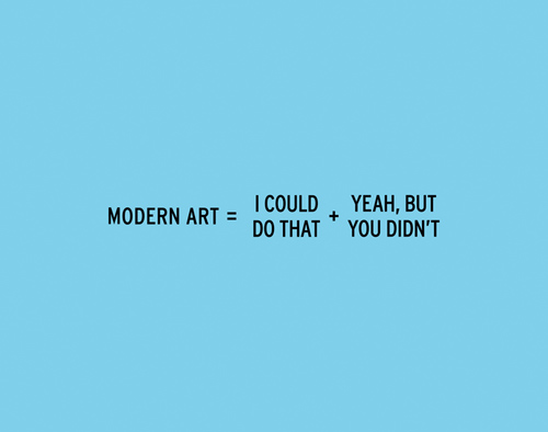
Me: Oh, look at this piece of art.
Friend: I could do that.
Me: Yeah, so could I, but neither of us did.
(via Design Milk)
Just another WordPress site

Me: Oh, look at this piece of art.
Friend: I could do that.
Me: Yeah, so could I, but neither of us did.
(via Design Milk)
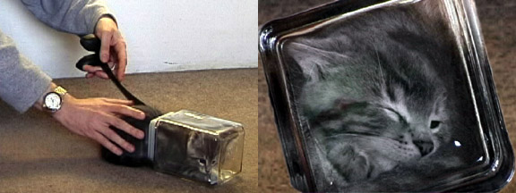
Oh the joy that bonsai kittens brought every teenage boy in the early 2000s… How vividly I remember the girls in high school getting to the verge of tears before we begrudgingly conceded that, while we desperately wished they were, bonsai kittens were not real.
A gem of a comment from the “Guestbook” on the bonsai kittens main website:
[email protected]: Months ago, you have masterfully shaped my kitten into a trapezoid; however, now, the 45-degree angle on the tail side is weakining, making her more of a rhombus than anything. Although, I could reinforce the front side with the angular clamps you sell, I’m afraid she might turn out to be a parallelogram. Any tips?
(via Bonsai Kittens)
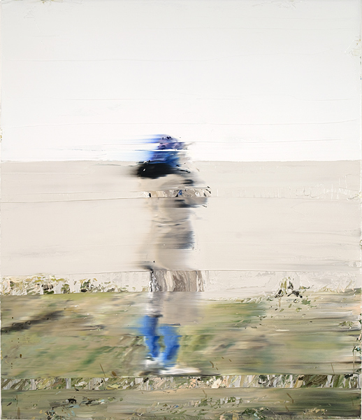
Andy Denzler’s line of paintings mimic the effect of an image being digitally compressed. It’s a pretty awesome effect, and the concept of the organic imitating the digital is quite intriguing.
(via kottke.org)
The New York Times has become my go-to source for US news of any kind. I find their writers to be intelligent and able to convey their ideas through words with little apparent effort. I also love the fact that the outlet hasn’t held back in any way/shape/form to adopt the internet as a perfect vehicle to communicate information with speed and creativity.
Moving away from the New York Times… Andrew Kuo is an artist who (to the best of my knowledge) is best known for the info-graphics that he creates for the New York Times. The illustrations each have some theme relating to music and his quantification of various quasi-quantifiable data. I love them all, and here are 5 of my favorites.

My admiration for Bjork will always go understated simply because I don’t have enough words to summarize her genius. The experimentation and exploration that she accomplished through her albums is reflected in her live shows. If you ever have the chance (and a full bank account), make sure to see her when she comes you way.
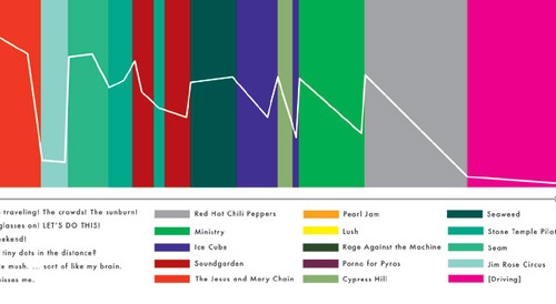
As I started going to concerts and music festivals about 5 years ago, I unfortunately missed the Lallapalooza of 1992. Look at that lineup! Chili Peppers, Ministry, JAMC, Rage, STP. Damn. I mean, Coachella is amazing too, but Lolla ’92 looks like it was a “best-of” compilation of the past few Coachellas.

While most of Kuo’s info-graphics have a level of comedy, I find this tops them all. I think that the humor of his pieces comes from the viewers ability completely/partially agree/disagree with the data that is represented. Opinionated data…
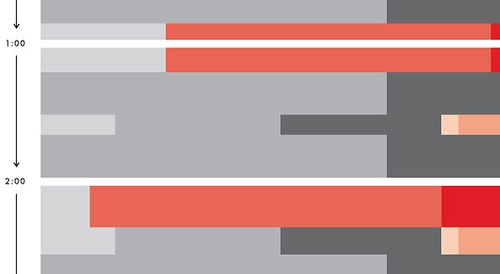
Two best “variables”:
Insanely lazy… a song with a half-cooked hook and Auto-Tune!? C’mon Kanye- it’s 2008. (T-Pain is rolling over in his grave.)
This is curiously catchy and at least is doesn’t have a Daft Punk or M.I.A. sample in it… bye, hater!
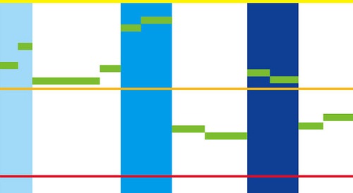
After having seen Hot Chip 5 times (yes, five), I believe that it’s safe to say that I love their live show. I think I included this graphic in my top 5 just because it’s about Hot Chip. Who cares if that makes me biased? That’s what all of these illustrations are about!
After having visited the various museums around LA (the Getty, Norton Simon, Huntington, and the various museums here at Exposition) over the past couple years, I finally made it to LACMA. Visiting museums presents a mild catch-22 for me: I don’t like going without a group of other people, but I don’t like to walk around with that group. I’d much prefer to go on my own and sit in one spot for a half hour if I want to without worrying about if the rest of the group is getting annoyed. Luckily, I’ve found that plenty of people feel the same way and don’t really care if we stick together as a group or not.
On another “freshman outing” coordinated by the grad Radomir, about 10 of us headed down to check out the latest addition to LACMA: the BCAM (Broad Contemporary Art Museum). We started off the night at Souplantation, which turned out to essentially be a step up from college cafeteria-style dining. After wondering why a Frank Lloyd Wright quotation was on the wall and having our fill of soup, salad, bread, and desserts we embarked on the traffic-packed journey that was 3rd/Fairfax/Wilshire to LACMA.After 5pm, everyone gets in free, so being the cheep college students we are, that’s exactly what we went for.
Starting off, the BACM goes top down (kinda like the Guggenheim I guess) and each of the three floors is massive. The first floor (which is actually the third) opens up to the exhibition that all the press in focusing on. The pieces are very large, metallic, incredibly shiny, balloon-shaped objects by Jeff Koons. These include dogs, an egg, and other things that are just big and colorful and reflective. Also in this exhibition are a few pieces by Andy Warhol. After spending a good part of a month focusing on Pop Art last semester, I’ve done a bit of reading on him and was very surprised to see his Elvis at LACMA. While only one copy was on display, it reminded me of the fact that they used to be displayed repeatedly overlapping across an entire wall. Very Pop and very gay, as was Warhol.
Of the three floors, the first had the largest pieces, the second had the most pantings/photography, and the third was all (I think) Richard Serra pieces. Again, last semester we spend quite a bit of time on installations and public art. Serra’s Tilted Arc was the focus of our discussions, but his two pieces at LACMA are far more interesting in my opinions. While Tilted Arc is clearly a prime example of how public art can be received by its audience (and I agree that it was very intrusive), these two were not out in public, and I think that their place in a large hall is perfect. Both pieces rise up about 10-15 feet and are made of rusted steel. One piece is a massive figure eight and the other (which we didn’t spend much time at) was similarly contoured, but I’m not sure what its shape is.
After we left the BACM, we headed over the main part of LACMA, but our time was limited. In about an hour and a half, I saw some great Southern Californian pieces, a Rothko, two Pollocks, some Picassos, a Braque, and countless others. At 9, we were kicked out and LACMA closed. Naturally, we spend another hour driving aimlessly around LA and eventually wound up back on campus. It was a good night.
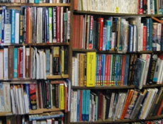 So I’m sitting in AFA (Architecture & Fine Arts Library) doing some research for the art history paper that is due next Monday, and I need to get a book. So I open my laptop and head to HOMER (the library catalogue database) to see if we have it. First try: score. USC just happens to have a copy of Modern Art and Modernism: A Critical Anthology by Francis Frascina and Charles Harrison from 1982. Lucky me, I can continue my quest to link Robert Morris’ “Notes on Sculpture Pt. 1” from Artforum to the two pieces of art I have yet to select. That the book was in the library was a pretty sweet coincidence that winds up happening about four more times until I’m fully confident that – here at USC – every book in the history of the universe is/was/will be located in one of our libraries. I say “was” because books get stolen. It always sucks when you do a search it is comes back as being due two years ago… But I stand firm, somewhere in the vast (and horribly creepy) bookstacks of USC lies the meaning of life.