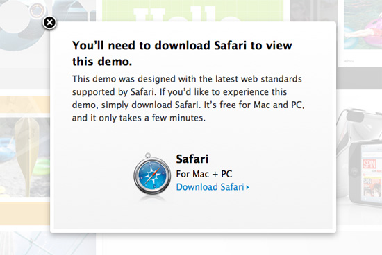
Apple’s new wall of exclusion: a demo of HTML5 and open standards

wait, I thought Firefox, Chrome, and Opera supported HTML5 too...

Apple has been catching a lot of flack for it’s HTML5 Showcase page it recently put up on its website. And for good reason! The problem with the site is that it purports to be a page intended to

show how the latest version of Apple’s Safari web browser, new Macs, and new Apple mobile devices all support the capabilities of HTML5, CSS3, and JavaScript.

So what’s the problem? You can only view the demos with Safari. If you’re using Firefox, Chrome, or Opera – all modern browsers that support HTML5 – you get the error message shown in the image above. The fact that Apple is browser sniffing and excluding products that are all capable of displaying the content on those demo pages is troublesome.

Christopher Blizzard of Mozilla summarizes the issue and what’s really important in this way,

The most important aspect of HTML5 isn’t the new stuff like video and canvas (which Safari and Firefox have both been shipping for years) it’s actually the honest-to-god promise of interoperability. Even stodgy old Microsoft, who has been doing their best to hold back the web for nearly a decade, understands this and you’ll see it throughout their marketing for IE9. (Their marketing phrase is “same markup” – watch for it and you’ll see it everywhere in their messaging.) The idea that the same markup, even with mistakes, will be rendered exactly the same. HTML5 represents the chance for browsers to work together and find common ground.

It really sucks that Apple thinks it can push the market around like this, but it’s great to see that people aren’t going to take it.

intellectual honesty and html5 -Christopher Blizzard

Eventbox is beautifully unnecessary

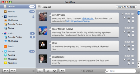
what the eventbox "unread" window looks like
what the eventbox "unread" window looks like (click for a larger view)

Seems like this new little app called Eventbox is getting all kinds of hype right now, so I figured I’d check it out to see if it’s worth the $15 that its developer, The Cosmic Machine, is asking.

Functionality

While the functionality of an application is probably its most important aspect, in Eventbox’s case, it’s where it falls short. Eventbox tries to position itself as a place that brings together all of your friends’ online social postings for your to view in one spot. It’s essentially an RSS feed aggregator for social activity. As of v1.0, Eventbox supports gathering data from Facebook, Twitter, Flickr, Reddit, and RSS feeds.

While I’m all for what aggregators do (Google Reader is probably my most visited bookmark), there are far superior alternatives to Eventbox. Maybe if it supported more sites, although I can’t think of too many more that interest me, Eventbox would seem more necessary. Feed aggregators are necessary because people read hundreds of site’s postings, but as far as activity postings go, I only really need Facebook and Twitter. Two sites don’t warrant a dedicated app that can’t replicate each site’s full functionality (Facebook is about a bit more than status postings).  FriendFeed, Netvibes.com’s widgets, or any number of other online apps do Eventbox’s job with much more finesse.

Design

Now that you know how ridiculous I think this app is, here’s how incredible its design is. In all honesty, Eventbox is a shining example of why people get hooked on Macs when they switch from PCs. The icons, the layout, the styling of its various animations, and the flow of moving through the app all contribute to something that looks and works perfectly.

I really wish that Eventbox had more of a purpose because it’s such a joy to work with.

Overall

I hope it’s pretty clear how I feel about Eventbox. It’s a beautifully designed application that I have no use for. There is praise coming from all around, but I can’t sing the same tune. I love Facebook, Twitter, Flickr, and the rest of the social networking sites, but I already have a browser, and my homepage (Netvibes.com) already puts those sites together.

Google yelling “monopoly”

microsoftyahoo.jpgFor a while now, my opinion of Google has been declining. There isn’t really one big event that has caused this, but I guess it is the compilation of the following:

  • Their site design is horrible. Apart from the Google.com search hub, the minimal approach is unnecessary. Some might argue that this style is the best kind of UI. I argue that it isn’t intuitive, and that the lack of any design doesn’t do any good.
  • Adsense seems to be getting worse at judging what content to base the ads off of. Contextual ads aren’t revolutionary anymore.
  • Innovation on projects like Google Docs has seemed to slow down. I loved Writely, but since Google acquired it, the plain UI has left is barren.

As you can probably tell, these problems aren’t issues that Google has actively done. They are all things that have occurred because of the expansion of this online ad company to encompass everything that an online service provider could offer. My problems with Google have been passively incured, until now.

Since Microsoft’s announcement of a hostile $44.6 billion offer for Yahoo Inc., Google has gone on the offensive and issued a public statement criticizing the offer. The post from Google’s official blog titled “Yahoo! and the future of the Internet” is a blatant attempt to bring negative attention to the situation.

In the post, Google states that while the internet has been about the principles of “openness and innovation,” Microsoft might try to “exert the same sort of inappropriate and illegal influence over the Internet that it did with the PC.”

“In addition, Microsoft plus Yahoo! equals an overwhelming share of instant messaging and web email accounts. And between them, the two companies operate the two most heavily trafficked portals on the Internet. Could a combination of the two take advantage of a PC software monopoly to unfairly limit the ability of consumers to freely access competitors’ email, IM, and web-based services? Policymakers around the world need to ask these questions — and consumers deserve satisfying answers.”

Why is this a ridiculous statement? Because the listed web services (email, IM, and web portals) aren’t where the money is being made. Google is an ad company, so why would an ad company be so concerned with another company that – according to Google – will dominate these web service markets? Because Microsoft and Yahoo have made their attempts at ad-selling departments as well.

What Google fails to point out in this statement is that they are the dominant leader with more than 65% of the ad-sales market. Monopolistic practices by Microsoft? If anything, the monopolistic practices for revenue-generating departments have been on Google’s side.

I don’t mean to come off as a Microsoft fanboy (I own a Mac for my everyday use, but I love my Zune) or as a Google hater (I use Gmail both for personal and USC email accounts). All I’m trying to say is that for too long, Microsoft has been an easy target to yell monopoly around. Just because a company is successful and has a corporate face (as opposed to Google or Apple’s fun-eco-friendly faces) doesn’t mean that its sometimes aggressive, market-upsetting actions are illegal.